01 / 01
PROJECT HIGHLIGHT
A visual identity drawn from road markings
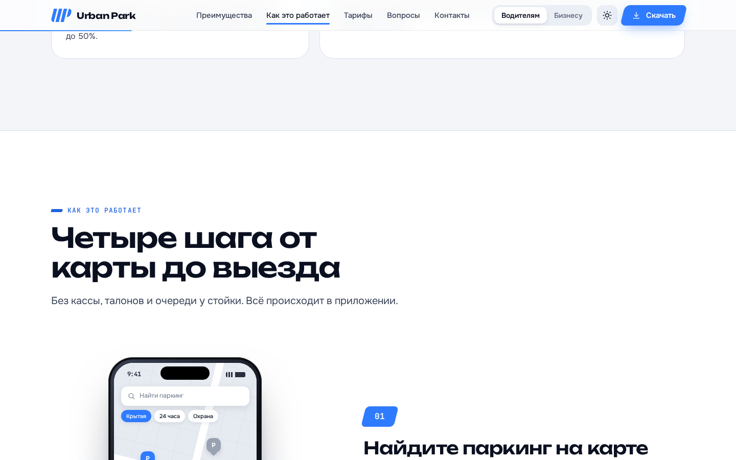
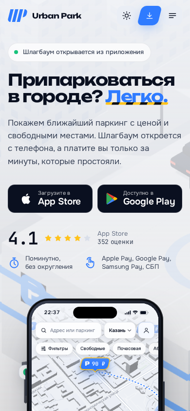
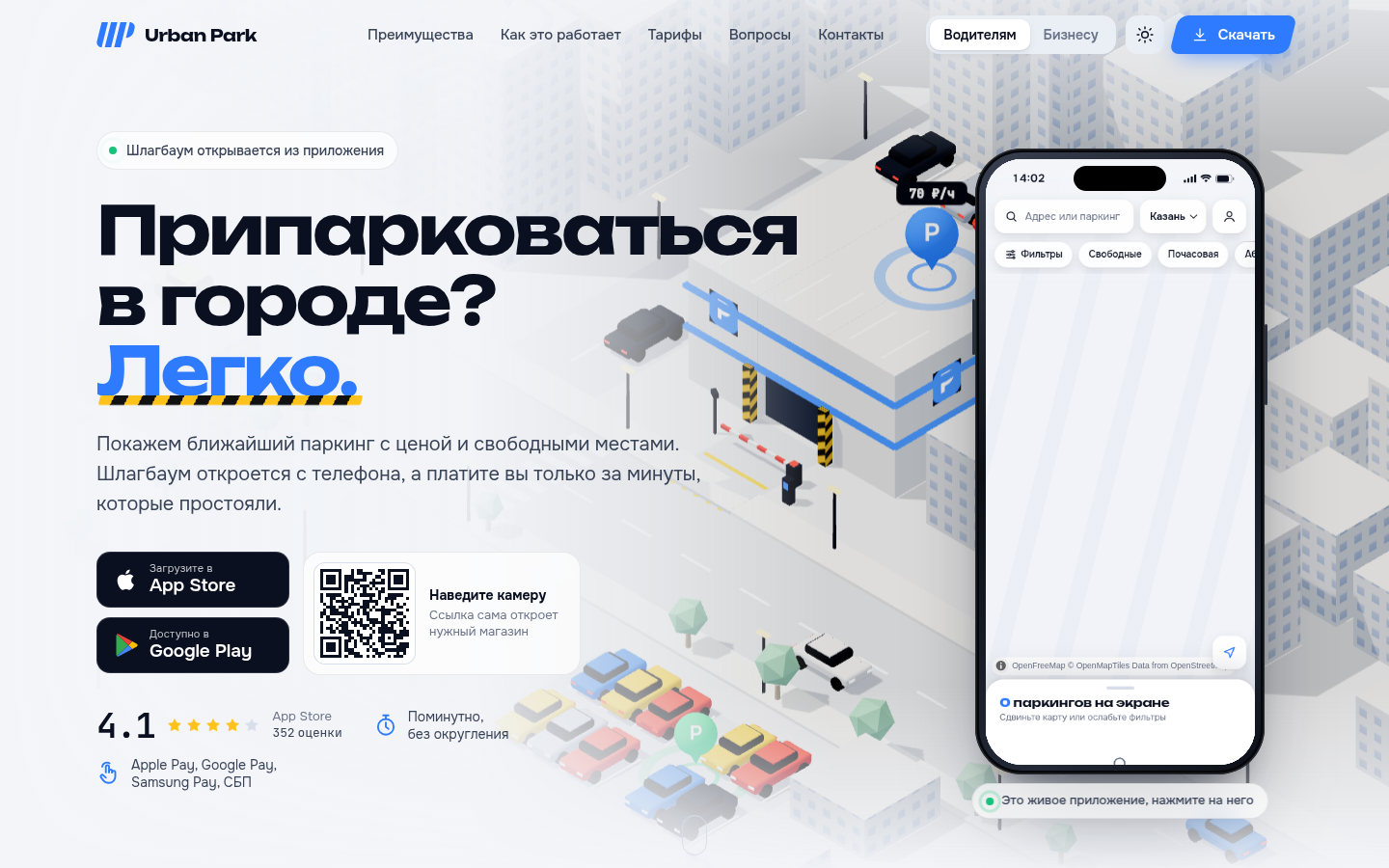
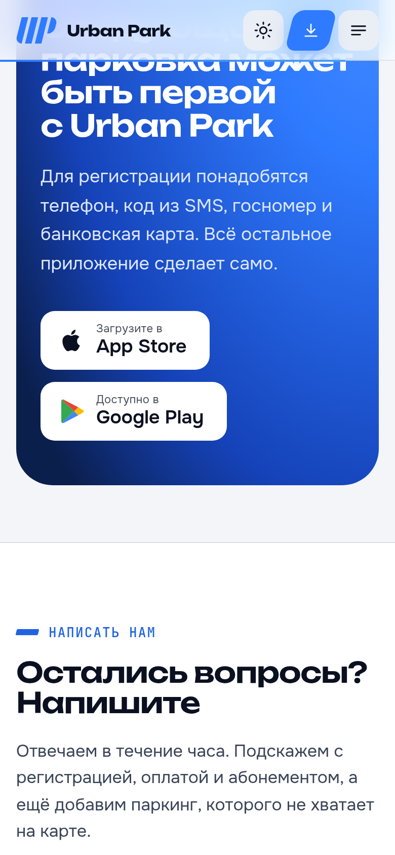
The logo’s angled lines shape dividers, accents and buttons. They connect the interface to parking without decorative illustrations and help important map actions stand out.
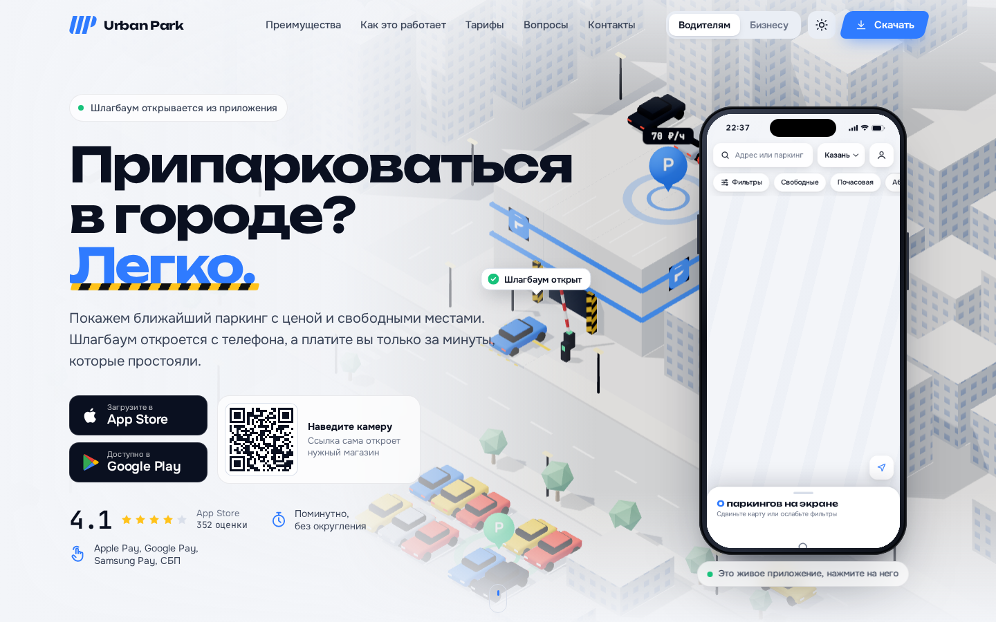
Find parking on the map and check the tariff.
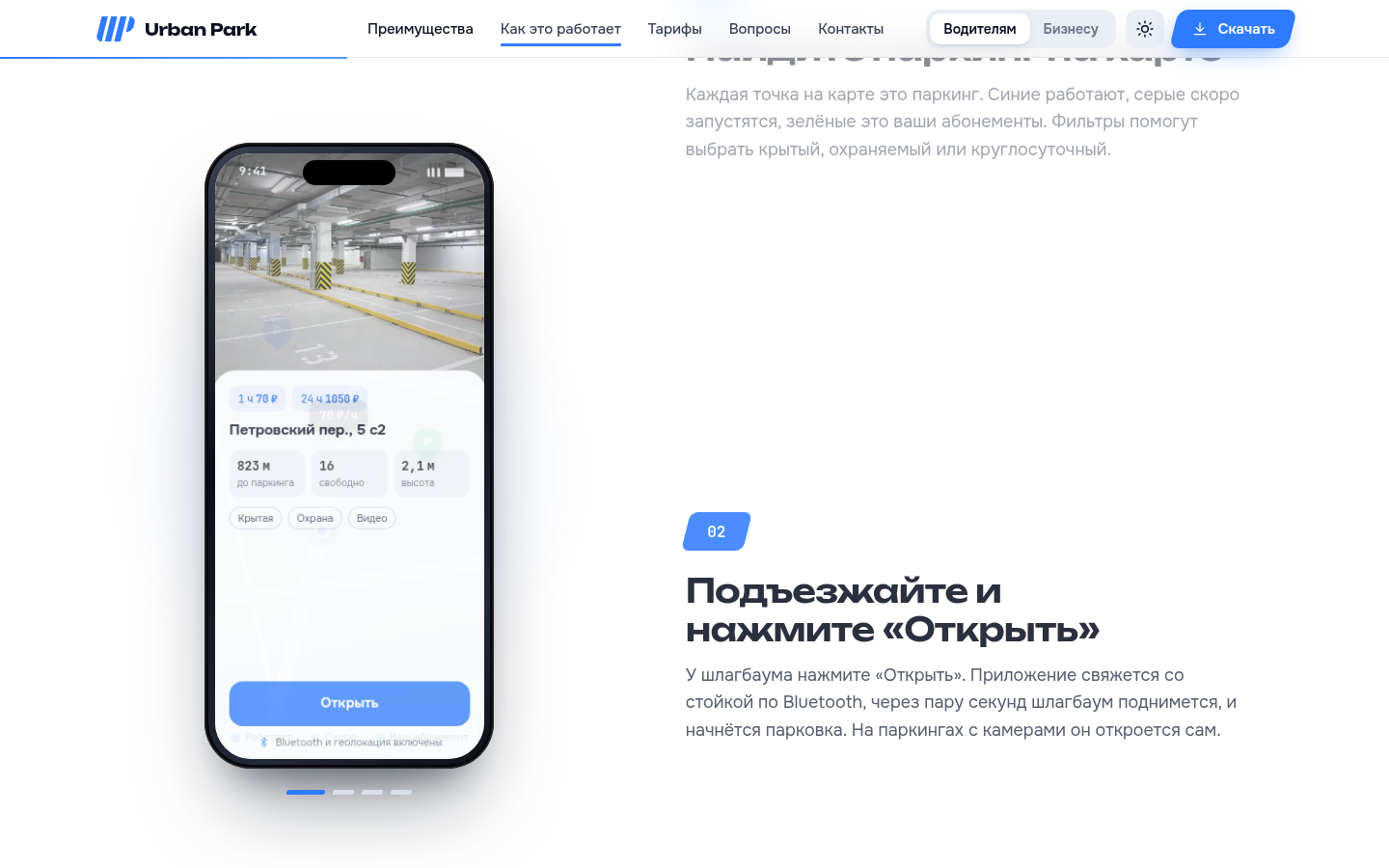
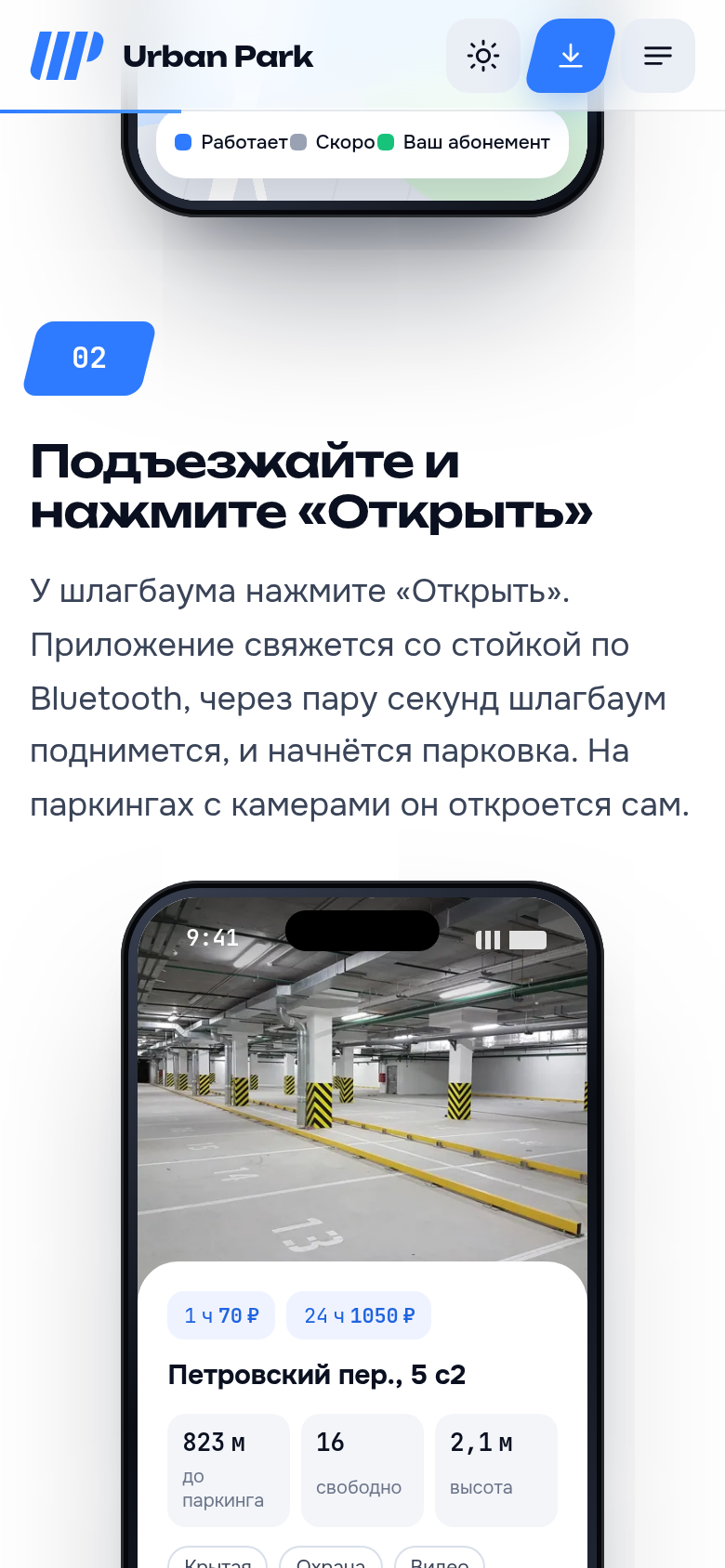
Open the barrier and manage the parking session.
Check time and cost, then proceed to payment.
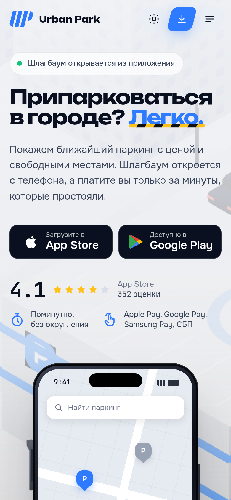
What the product looks like and how people use it.
Maps, tariffs and parking sessions share a consistent visual language. Clear numerals make costs and time easy to read.
How the data, integrations and service fit together.
Shared components and styles connect the website and app interface. Light and dark themes follow the same rules.
The logo’s angled lines shape dividers, accents and buttons. They connect the interface to parking without decorative illustrations and help important map actions stand out.
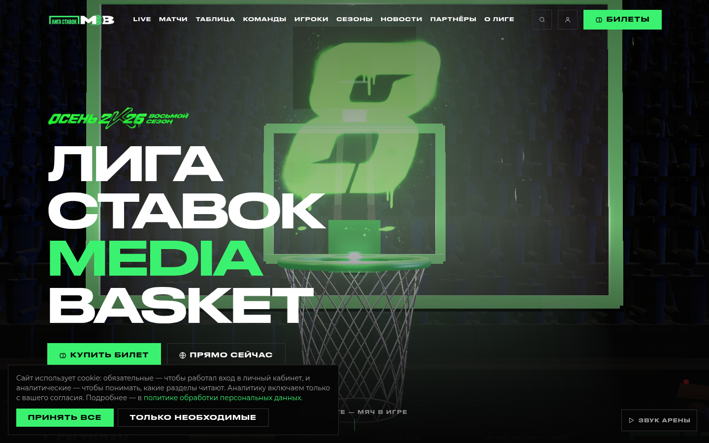
Fixtures, results, teams and players in one place. Fans can follow the season and organisers can maintain league information.
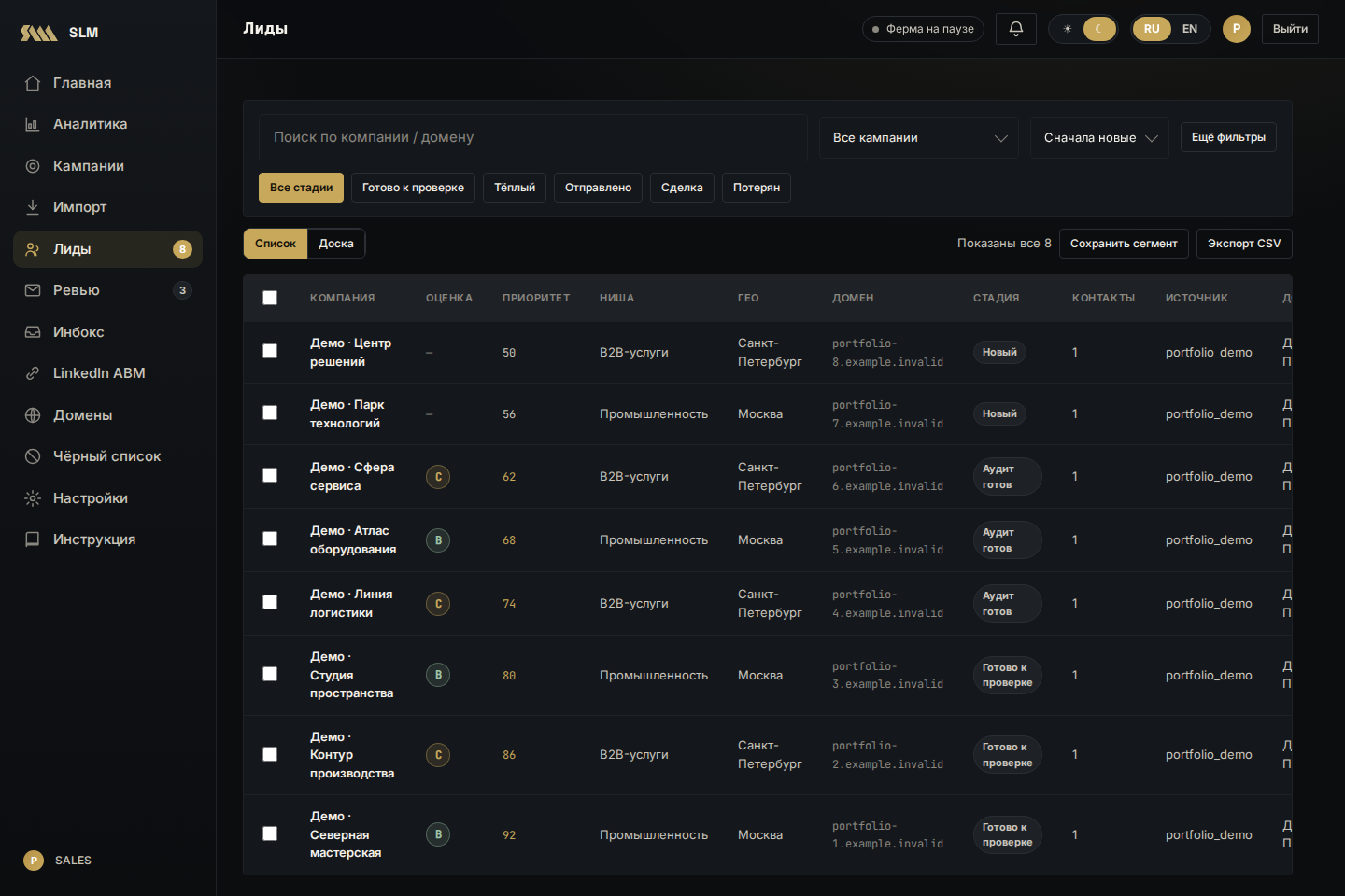
From finding companies to handling replies: leads, website audits, personalised drafts and a review queue in one service. Sales teams see the company context before deciding what to send.
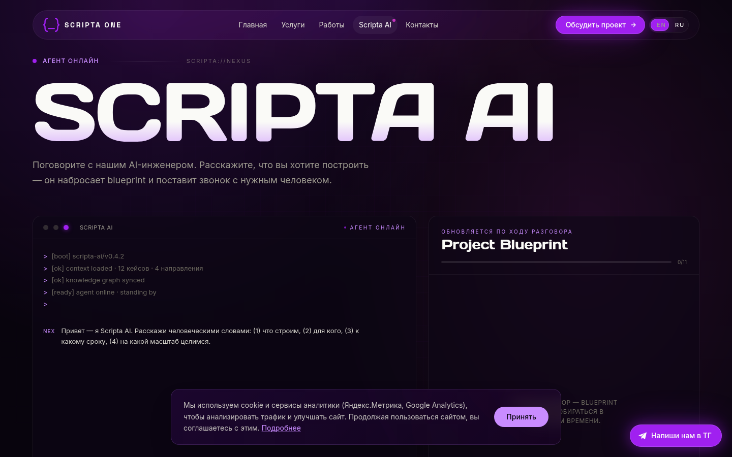
A website assistant collects project requirements and passes them to the team. Visitors describe their needs in a conversation rather than a long form.